NeuroMind 2.2 for iOS7
All right, I start to get the hang of it… today I’ve been working on the layout for NeuroMind’s upcoming 2.2 version which is tailored for iOS7. The issues I mentioned yesterday (did not show all of them in the screenshots ;-) ) are now all gone. The new layout is clean, fits well into the iOS7 look, and works as it should. I also removed a few small bugs (you might not even have noticed them), so technically I am done. Except for the new icon size, that is. And maybe even a totally new icon – have not decided on that one!
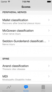
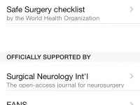
Well, this screenshot kind-a gives you an impression what the iOS7 version is going to look like:
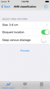
I changed the section headers to uppercase and added a blank row in front of them. That way I did not have to mess with the default layout (which I like) but sections remain clearly separated from each other. Further I fixed the issue in which an info button whas shown inside a selection row, it now looks like this (example from the decision support section):
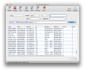
Nice… so now the technical work is done, and I can use the occasion to update some content as well. Thanks to all of you who have sent me new classification systems, I am currently integrating them in the database. For those who are technically interested, when working on Mac OS X I prefer SQLiteManager for editing the SQLite database.
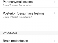
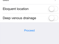
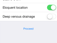
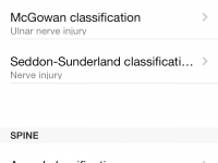
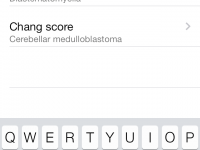
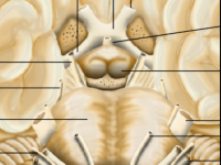
Some more screenshots are available below… will be back after updating the database!
Looks nice! – way better than the iOS 6 and prior version! (well, maybe that’s because a default app in iOS 7 just looks better)
Few tips:
– Change the TintColor (especially for the Toolbar) to a not default color, maybe one that is more suitable like green?
– Add translucency to the TabBar for a more iOS 7-ish experience
– Same for the Toolbar
– Take a look at the rest of theiOS 7 UI Transition Guide for more cool stuff :)
Addition to the prior list of tips:
– Find Tabbar icons that look more appropriate in iOS 7, like these ones: http://abduzeedo.com/free-line-icons-inspired-ios7